Typetych
In my Explorations in Design class, we were tasked to create two different alphabets. One alphabet should be created using tools and/or processes not typically used by type designers. The other alphabet should be destroyed by taking an existing typeface and mutilating/altering it in some way.

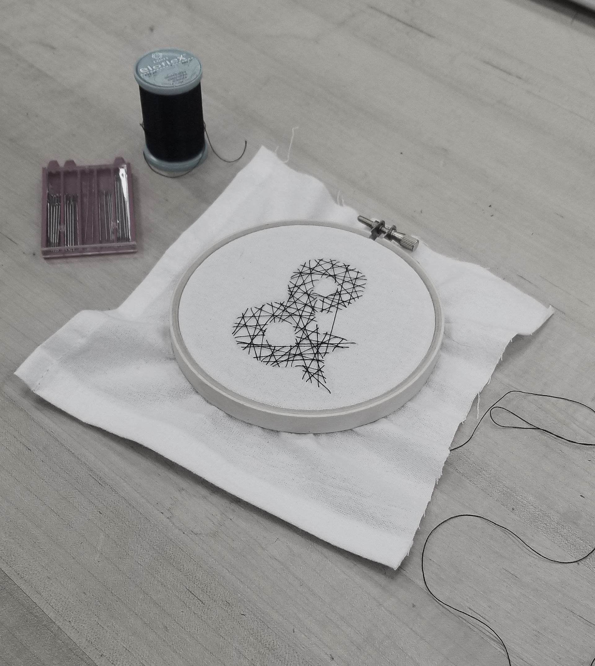
My first poster is creation. I wanted to explore a process that I have never used before, cross-stitching. I arranged the poster in a way to mimic each letter hanging by a thread, much like it did in reality with the stitching. I was reminded of puppets after seeing each hang individually and that is where the name Linea Automata came from.
I've never really cross-stitched before so I decided to use this method for the creation part of my type experiment! The process was INCREDIBLY time-consuming but I enjoyed every bit of it.
(Except poking myself with a needle)
________________________________________________________
DIN 1451 Typographic Documentary
Poster Design - 2022
An imaginary documentary based on the history and uses of the typeface, DIN. Din stands for Deutsches Institut fur Normung (German Institute for Standardization). Considering the uses of the typeface given on the poster, I wanted to make the colors stand out considerably as any traffic signage, etc. should.
The bold yellow and red lines in the poster represent the flow of roads and railways. While the yellow is slightly opaque and weaves through the letters, the red is made with the alphabet and numbers for balance and variety while also mimicking railroads.